A well-chosen two-colour combination can transform a home, creating a visually appealing and balanced atmosphere. Whether painting interiors or exteriors, selecting the right colours plays a crucial role in enhancing the aesthetics and mood of the space. This guide will help you choose the perfect two colour combination for home painting.
Colours have a significant impact on mood and perception. Before choosing a combination, it's important to understand the emotions associated with different shades:
By selecting complementary colours, the space can achieve the desired ambience. The right colour combination can also enhance the sense of space, making rooms appear larger or cosier, depending on the choice.
Key Factors to Consider
The following are key factors you should consider when choosing a perfect two-colour combination for your space:
Each room serves a different purpose, so the colour combination should align with its function:
2. Natural Light and Space
The amount of natural light in a room influences how colours appear. Light shades can make a small room look bigger, while dark tones add depth and cosiness. If a room lacks natural light, pairing a darker shade with a lighter one can balance the effect. For instance, painting three walls a soft shade and one wall a bold hue can create a dramatic yet balanced look.
3. Harmony with Existing Decor
Furniture, flooring, and decor items should complement the chosen colours. Neutral shades work well with any decor, while bold colours should be balanced with subtle hues. A colour combination that clashes with existing furniture can create visual disharmony.
4. Exterior Considerations
Factors like the surrounding landscape, architectural style, and neighbourhood aesthetics matter for exteriors. Classic combinations like white and navy blue or grey and cream look elegant. Choosing earthy tones like olive green and beige can help blend the home with its natural surroundings.
The following are some of the trendy two-colour combinations you must know:
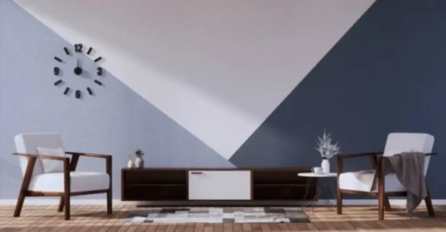
1. White and Blue
A timeless and versatile combination, white adds brightness, while blue brings a touch of elegance. This pairing is perfect for creating a calming and sophisticated environment. White enhances the openness of space, while blue, depending on the shade, can add a refreshing or royal touch. Light blue works well for bedrooms and bathrooms, while deeper blues are ideal for living rooms and exteriors, offering a bold yet balanced aesthetic.
2. Grey and Yellow
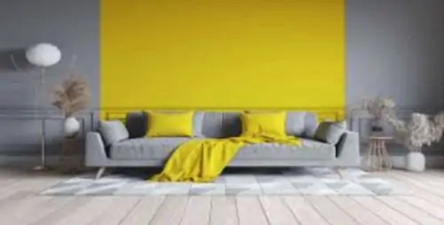
A modern and stylish pairing, grey provides a neutral base, while yellow adds warmth and vibrancy. The contrast between grey's subtlety and yellow's energy creates a dynamic look that works well in contemporary homes. Soft pastel yellows offer a soothing ambience, whereas bright yellow can serve as an accent to add liveliness. This combination is excellent for workspaces, kitchens, and living areas, where the balance between energy and sophistication is essential.
3. Beige and Teal
This combination balances warmth and freshness, making it suitable for living areas and bedrooms. Beige serves as a soft, neutral foundation, allowing teal to introduce a refined touch of colour. Teal’s deep tones create a luxurious feel, while lighter shades bring a more refreshing look. This pairing works well in modern and classic interiors, helping create a cosy and stylish atmosphere without overpowering the senses.
4. Green and Cream
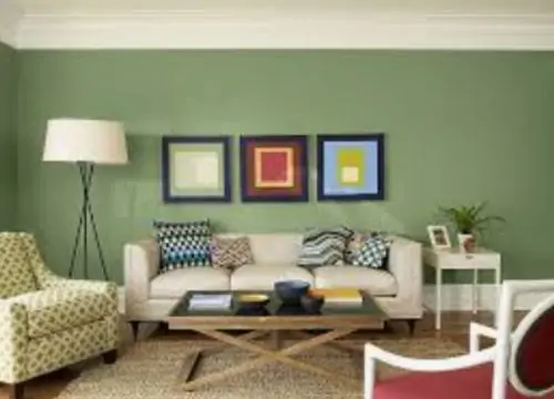
Green and cream are a nature-inspired blend that creates a peaceful and organic feel, perfect for relaxing spaces such as bedrooms and bathrooms. The cream’s soft, neutral presence helps green stand out without being too intense. Lighter green shades provide a fresh, airy atmosphere, while deeper greens evoke rich, earthy elegance. This combination is ideal for those who love nature-inspired decor and want to bring a sense of calm into their home.
5. Charcoal and White
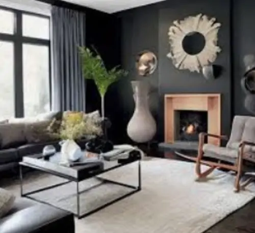
A sophisticated contrast that works well for both interiors and exteriors, charcoal and white create a sleek and modern look. Charcoal adds depth and character, while white brightens the space, ensuring balance. This combination works particularly well in urban homes with a desired contemporary feel. Charcoal accent walls and Nerolac Beauty Ceiling Emulsion in white would create a bold yet harmonious setting, making the space feel elegant and refined.
6. Peach and Grey
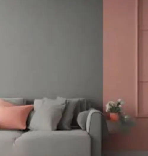
Soft yet stylish, this pairing is excellent for bedrooms and children’s rooms, adding warmth without being overwhelming. Peach’s delicate, inviting nature brings a sense of comfort, while grey provides stability and balance. Light grey keeps the space neutral, while a deeper grey shade enhances the depth of the decor. This combination works well in spaces where a gentle yet chic ambience is desired.
7. Brown and Olive Green

An earthy, warm combination that works well in rustic or nature-inspired interiors. Brown adds a sense of cosiness and stability, while olive green contributes an organic and refreshing feel. This pairing is ideal for living rooms, studies, or even kitchens, where a grounded, earthy tone is preferred. Whether using lighter wood tones or deep chocolate hues, brown and green together evoke a natural and inviting atmosphere.
8. Coral and Ivory
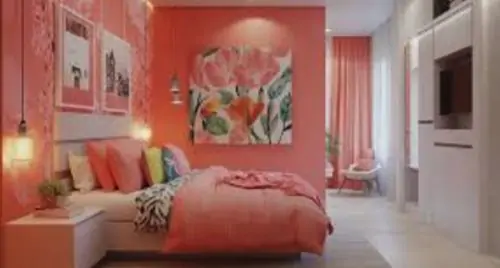
A lively and cheerful combination, coral brings vibrancy, while ivory provides balance. Coral is energetic and uplifting, making it a great choice for dining areas, living rooms, and accent walls. Ivory’s neutrality prevents coral from becoming overpowering, allowing for a bright yet elegant look. This combination works best in well-lit spaces, as it enhances the warmth and vibrancy of the colours.
Conclusion
Choosing the right two-colour combination for home painting services requires balancing personal preference, functionality, and design aesthetics. Understanding colour psychology, room purpose, and existing decor ensures a harmonious and visually appealing outcome. With careful selection and thoughtful application, a home can be transformed into a stylish and comfortable space that reflects the personality and preferences of its residents. Whether aiming for a modern, rustic, or classic look, the right two-colour combination can elevate the home’s aesthetics while enhancing its livability.


![[WATCH VIDEO] Sophie Rain and sister Sierra Rain as Black Spiderman goes viral](https://www.sociallykeeda.com/uploads/images/202403/image_140x98_660976c59cce0.webp "[WATCH VIDEO] Sophie Rain and sister Sierra Rain as Black Spiderman goes viral")

 Viral Videos and Photos Link Leaked On Internet")
![[WATCH] Meia Cassandra Viral Video Leaked; scandal explained](https://www.sociallykeeda.com/uploads/images/202401/image_140x98_65b7605057a56.webp "[WATCH] Meia Cassandra Viral Video Leaked; scandal explained")


![[FULL WATCH VIDEO] Will Levis And Gia Duddy Leak Video Viral On Social Media](https://www.sociallykeeda.com/uploads/images/202405/image_140x98_6651e7ae8038d.webp "[FULL WATCH VIDEO] Will Levis And Gia Duddy Leak Video Viral On Social Media")

 Android")
